Editing/Cleaning up Inkscape Files Part 1
Using Node Deletion and Line Dragging
Using Node Deletion and Line Dragging
Have you traced an image in inkscape but now it doesn't look right? It just needs a little editing.
Here is a file that I have imported into inkscape, traced and changed the view to outline.
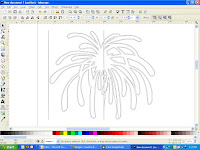
As you can see the file has some extra lines that need cleaning up.
Here is a file that I have imported into inkscape, traced and changed the view to outline.

As you can see the file has some extra lines that need cleaning up.
Step 1: Click on your image so you have the black box around it and click control+shift+k.
This should break apart your image so each piece has its own black box around it.
Step 2: Click on the extra line on the left and press delete. It should disappear.
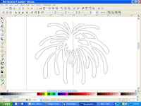
This should break apart your image so each piece has its own black box around it.
Step 2: Click on the extra line on the left and press delete. It should disappear.

Step 3: Zoom in on the extra line at the top and press the button on the left underneath the arrow button. This is the node button.
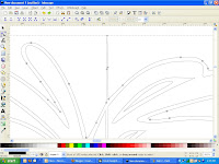

You can click on the top three nodes and delete them. I do this by using my arrow and drawing a box around the three nodes so that it highlights them all at the same time.
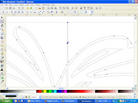

While they are highlighted, press delete. They should disappear and the line should be fixed.
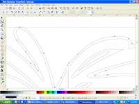

Step 4: Do this for the extra line at the bottom and the big one in the middle as well. If you find that you have accidentally deleted a node that you need, go to edit - undo and try again.
Step 5: Just below the center of the firework, you will see two spiky areas.
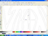
Step 5: Just below the center of the firework, you will see two spiky areas.

The top spike is easy to fix. Simply highlight the extra nodes and delete them. The bottom spike is trickier. When you delete the extra nodes, it changes the shape in a bad way.


In this case, you also need to delete the extra node on the right hand side.


Now we need to fix the shape. Grab the node on the top and drag it to the right.
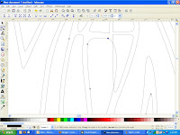

You can fix the right side of the line by clicking on it and dragging it to the left until it's where you want it.


After looking at the whole thing, I have decided that I don't like the way that section looks. That's ok. We can fix it. I think that I'm going to delete the three small sections and move the right line over. Don't worry, I'll show you. lol
I'm going to delete these three sections.
I'm going to delete these three sections.



No comments:
Post a Comment